Source: Predicting the Graphic Design Trends of 2019 – Hayley Salyer – Medium
Predicting the Graphic Design Trends of 2019
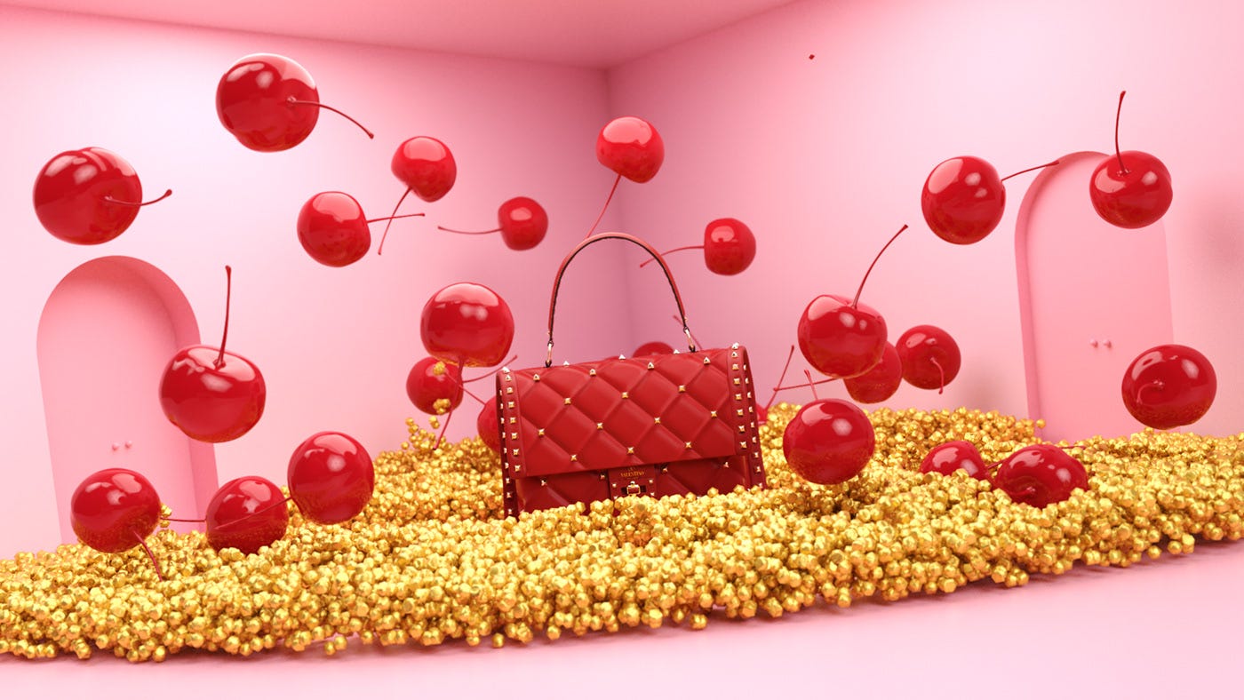
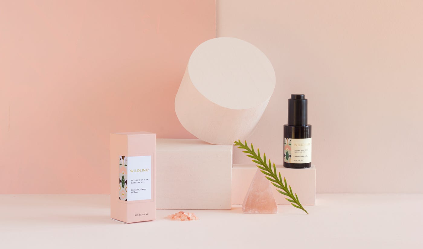
1. “How much is that puppy in the window?”
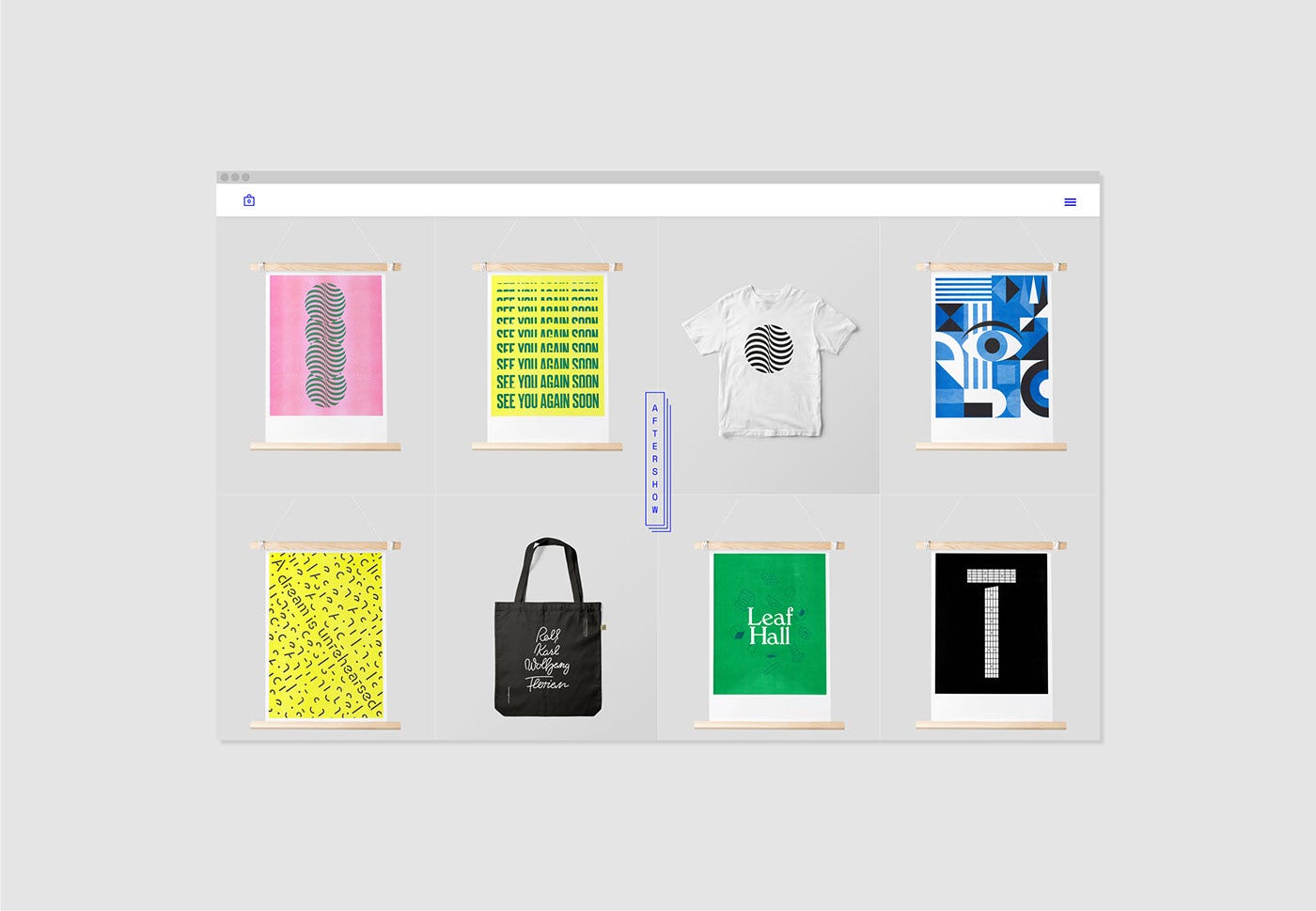
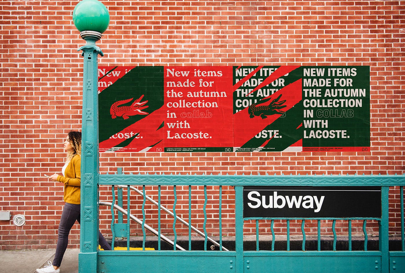
Brands are getting more and more creative with how they display their products. We started seeing this last year with colorful backdrops and modern, still-life positioning. This year, brands are building on that and taking it a step further by integrating other elements that almost mimic retail window displays.
This creative way of displaying product images will be particularly pertinent to B2B brands’ evolution into booming e-commerce sales. According to E-Commerce Platforms via Hubspot, B2B e-commerce sales are expected to outgrow B2C e-commerce sales by 2020.
Take a look at a few of the examples below. Couldn’t you see similar concepts walking through the mall during your holiday shopping?


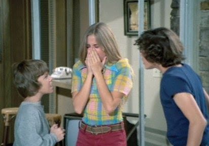
2. “Stayin’ alive, ah, ahh, ahhh…”
Let’s throw it back to a few original designs from the feel-good decade. The fluid, round shapes evocative of a lava lamp. The unmistakable color palettes of an entire era.
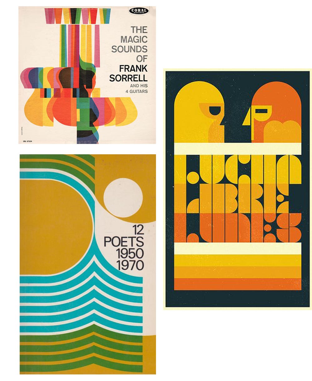
Similarly to a beautifully restored classic movie, the new Seventies-inspired designs take all the emotions of the classic designs but add higher resolution and clarity. The result? Some seriously stunning shapes and color palettes that are fun, relaxed, welcoming, and unconventional.


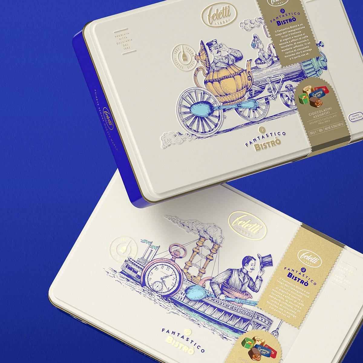
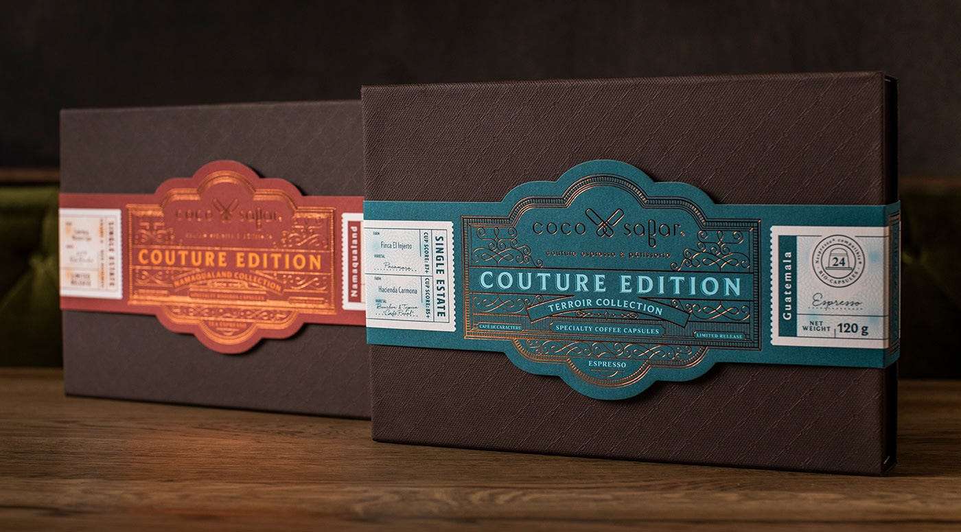
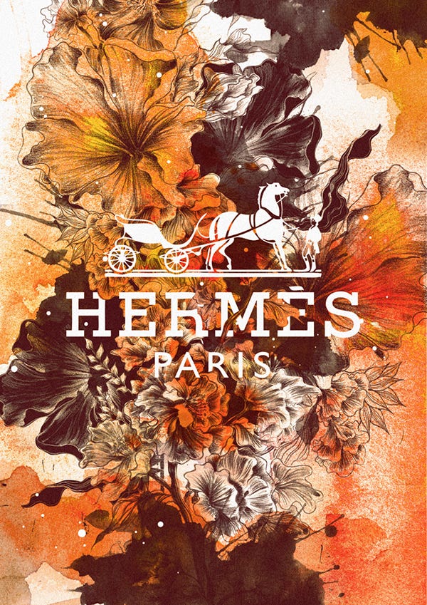
3. “You can’t repeat the past.”

Why of course you can, old sport. But I’m not talking about another Gatsby, art deco revival. I’m talking about busting open another time capsule, this time from the late 1800s to early 1900s. An aesthetic created by painstaking work done on a lithograph, the style is defined by an illusion of depth with shadows, vignettes, and layering with dimensional banners or ribbons.

Challenging even for today’s designers, these intricate and deliberate designs are staying pretty true to the original inspiration.

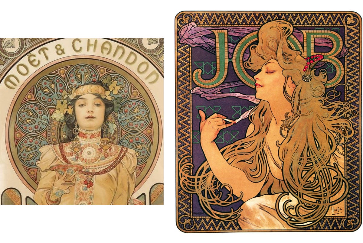
Check out the examples below from Alphonse Mucha, a famous Czech artist and pioneer in the Art Nouveau movement. He created these late 1800s advertisements for JOB cigarette rolling papers and Moët & Chandon.
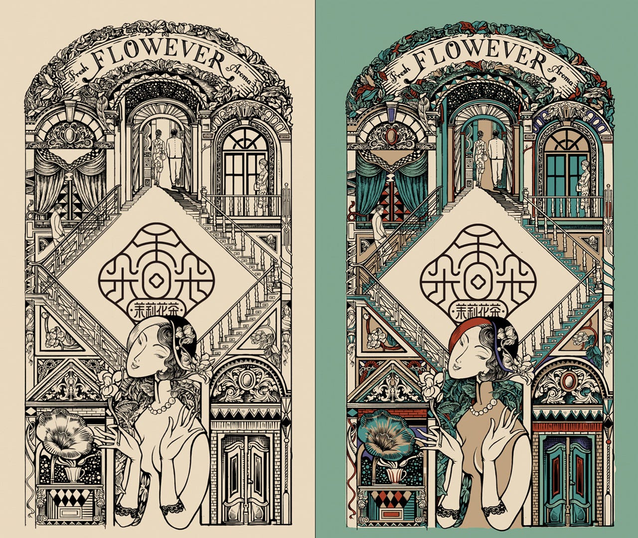
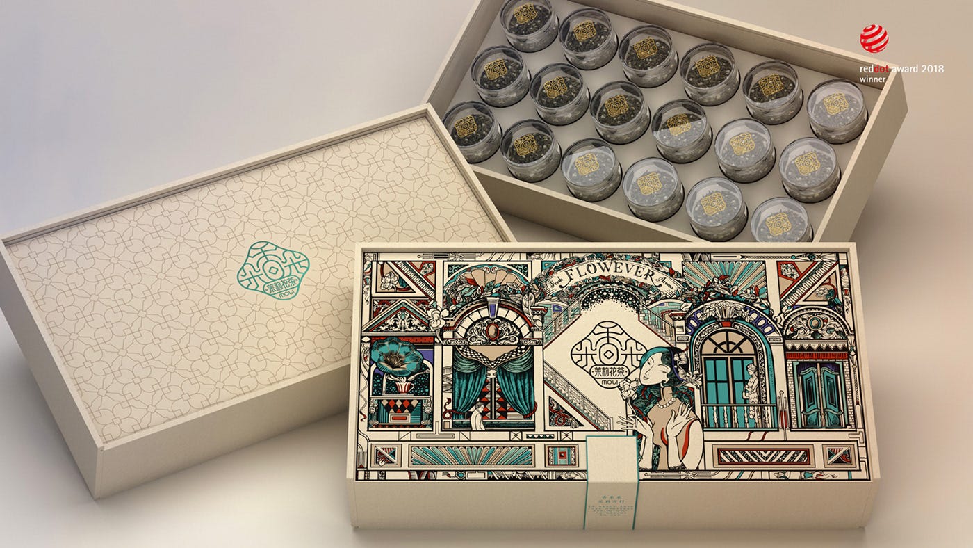
And now let’s come back to the present. Take a look at this beautiful packaging created for a tea company by Chinese designer Tiger Pan.
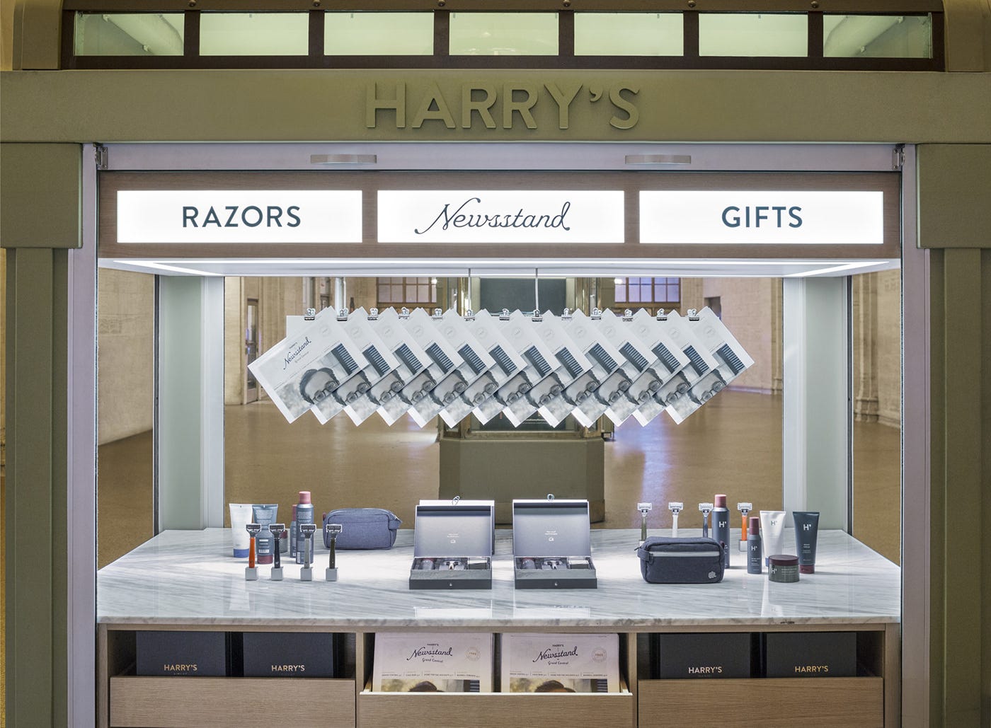
You don’t have to go all the way overseas to see this trend; here’s an innovative pop-up shop by Harry’s in the middle of Grand Central Station.

4. Get your mouse off that saturation slider.
If you read my post on 2017 design trends, you’ll remember it was all about loud color schemes. A large part of 2019 will be all about these soft, delicate naturally-occurring colors. Think shell pink, sandy beige, faded seafoam green, and more natural neutrals.

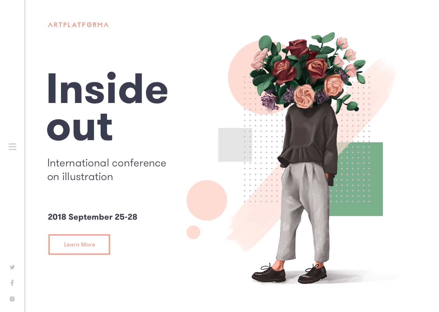
5. Do you even draw, bro?
Digital art vs. traditional art. It’s an age-old battle that people love to Photoshop-shame designers, and harass traditional artists for not being with the times. But can’t we all just get along? In 2019, you’ll see more digitization of hand-drawn illustrations, typography, and graphics. You’re also going to see hyper-realistic brush strokes, down to the bubbles in traditional watercolor to the imperfect streaks of pastels.


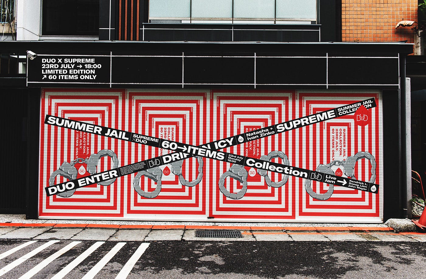
6. “Introduce a little anarchy. Upset the established order, and everything becomes chaos.”
For the past three years, designs have been carefully constructed. Well developed. Thoughtful.
Now it’s time for you to meet chaos. F@$% best practices. This is a visceral, go-all-in, move-fast, break-it-all kind of trend. So is it just a rebel cry for more freedom artistically? Not exactly. If anything, this is the most psychological, purposeful of all the trends on this post. Much to the dismay of all the perfectionist designers out there, chaos cuts through the mundane. It’s stopping you in your tracks. It makes you stop as you’re walking up the same street you take to work every day. It makes you stop if you’re clicking through the usual number of emails in your inbox. Clean only belongs to some brands, but chaos is for everyone, if you dare. Remember, there are no rules here.

7. “Oh no, my ad! It’s ruined.”
So many flawless designs. Just like Marcia’s nose, they are pretty and perfect — and completely predictable. Stemming off from the chaos theory that audiences will stop to stare, the “ruined” trend is for brands that want to bring something new to the proverbial table (but not destroy the table, kthx).
But why would you want to ruin a perfectly great design? Our prehistoric brains fill in the gaps of what we see with things that we are familiar with and expect. And although this helped us to not get eaten by lions, tigers, and bears, our brains still operate on those principles. The ruined trend is simply throwing our brains a little bit of confusion. A brushstroke over the eyes of a model on a magazine cover. A colorful splatter in the corner of an otherwise perfectly minimalistic ad. An unexpected cutout in a font. A girl letting go of a heart-shaped balloon, half-shredded. Wink, wink.


Cheers to 2019!
– Hayley