Getting people to sign up for the product is tough. It requires a lot of time, energy, and money, yet many products are losing most of those hard-won users immediately after their first-time experience. According to the Andrew Chen research:
The average app loses 77% of its daily active users within the first 3 days post-install
Businesses invest so much in acquiring new users, only to lose majority of them immediately after their very first visit. You definitely don’t want your company be one of them. But how can you do better? You need to make a great first impression by creating a perfect onboarding process.
Onboarding is a human resources term was borrowed by UX designers as a way of getting someone “up and running” with a site, app, or service. It’s the process of increasing the likelihood that first-time users become full-time user when adopting your product.
There are a number of considerations when you are designing your onboarding to define how best to get your users familiar with your product and its value.
Avoid Long Up-Front Tutorials
Reduce a friction on a user’s journey by following a simple rule “show less, provide more”
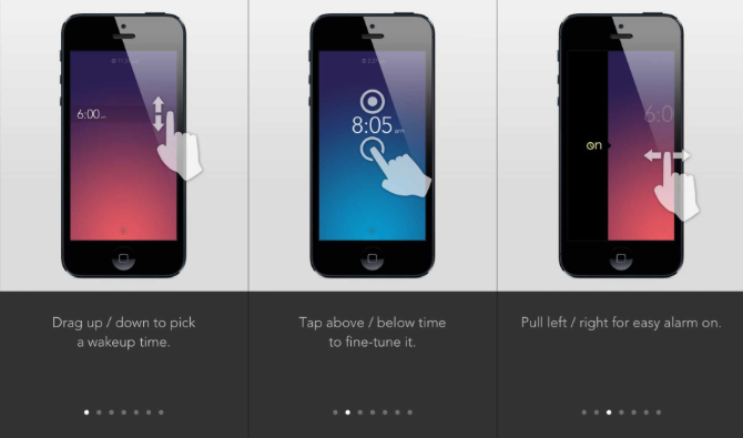
Almost every app on the market today has a swipe-through tutorial shown on the first launch. It aims to introduce what an app does to a user:
Static screens suppose to demonstrate the value of the product. Credits: Min
Or educate users how to interact with app by explaining the most common actions:
Clear, a to-do app for iOS, asks users to read a 7-screen tutorial before they can start doing anything with the app.
A number of problems exist with these long swipe-through tutorial / value proposition tours that we see in many apps:
A swipe-through screens are momentum killers. They inject a barrier between new users and the app. Even when the tutorial beautifully designed or seemed fun, users don’t have the patience to sit through it. Why? Because most users want to start exploring the app on their own. They want to first establish a relationship with the app, see what it is about.
Users cannot be expected to read a manual before using your app. People do not launch an app to spend time learning how to use the interface, all they want is to complete a task in as short an amount of time as possible. So don’t make your users feel like they have to study in order to use your app.
Make Onboarding Contextual
Rather than asking your users to remember everything up-front, you should provide guidance as they go
Up-front tutorials have another usability-focused problem —they require users to work upfront — users have to patiently read all the information and try to commit it to their memory. Even if they decide to read the instructions, they usually forget everything as soon as they close the overlay (unfortunately, our short-term memory cannot retain very much information).
Expecting users to remember every available function before they have even seen the app or site is obviously too much
New users don’t sign up for your product because they are excited about learning how your UI works. They signed up because they were interested in the value that you promised to deliver.
A contextual (or just-in-time) onboarding approach is a good alternative of static screen-by-screen tutorial. It’s a way to provide helpful information at the point of action: the guidance you offer is specific to the user’s current point in the journey and you show only the information necessary at that point in the interaction. It’s a simple, yet powerful design technique which can be implemented in many different ways:
Sample data. A “Welcome Board” is the first thing user sees in task management app Trello. This board includes pre-populated to-do list items, with each item explaining a different interaction or feature within the app. This approach allows users to learn features much more effectively than a static screen.
Trello easing customers into the product quickly. It shows what using it would actually be like.
Focused Tips. Contextual tips can be found in YouTube app for Android. App minimizes the amount of instructions by focusing users’ attention on a single, primary action. It uses instructional overlay to explain an unfamiliar interaction, but these hints appear on the first launch for new users, one at a time, as the user reaches the relevant section of the app.
Instructions in apps must be designed for optimal scannability, as users tend to dismiss them quickly.
Interactive tour is a user-guided tour where hints are only triggered when the user reaches the appropriate point in their experience. Thus, hints may appear in different orders for different users. Duolingo knows that learning by doing things is the best way to learn and uses an interactive way of progressive disclosure to show users how the app works. Users are encouraged to jump in and do a quick test in the selected language.
Duolingo has a user-guided tour which consists of a quick test
Tip: Including visuals alongside written instructions allow users to get the basic idea of what to do without reading very much.
Maximize Empty States
Consider a “first-use” empty state as part of a cohesive onboarding experience
Content is what provides value for most apps and websites. It’s why people are using them — for the content! Thus, it’s critical to consider how we design empty states, those places in the experience where a user might not have content yet.
Empty state is a very natural point to inject some onboarding to continue guiding users along. Instead of leaving it blank, you should use it efficiently— to guide, educate, and prompt.
Good empty turns a moment of nothing into something
Encourage users to engage with your product:
Help them get comfortable by setting expectations for what’ll happen.
Provide an obvious way to move forward to that next step.
For example, the first page users see after signing up for Instagram is empty. Other profiles have photos, likes and comments, but first-time user’s account is full of nothing — 0 posts, 0 followers, 0 following. To make the activation easier, Instagram has turned this “empty state” into a learning opportunity: where you would normally see your photos, it says “No Posts Yet — Tap on the camera to share your first photo or video” with an arrow pointing to the camera option.
Instagram knows that the first goal with an empty state is to teach people how to use your app
Tips: Deliver the information in a show-or-tell format — “show” the user what the screen will look like when it’s populated with sample data, or “tell” them with a written explanation.
Introduce Success States
Let your users fell great when they get to their first win
The moment a user completes an important task is a great opportunity for you to create a positive emotional connection between them and your product. Let your users know that they are doing great by acknowledging their progress and:
Celebrate success with the user
For example, MailChimp, a web service for creating and sending emails, rewards users for creating and scheduling their first e-mails by adding unexpected humor and positivity throughout the process.
Mailchimp’s design communicates emotion in all its forms
Tip: Use success states as an opportunity to really let your personality shine.
Measure!
Constantly iterate and measure everything
Metrics are crucial when looking at whether your current user onboarding is successful and in figuring out where it needs improvement. You should define an activation metric and get serious about tracking the inputs to that metric. Before you begin any new onboarding project you should ask yourself “How does this project increase our activation metric?”
Get Inspired
Great resources for exploring existing onboarding experiences is UserOnboard, created by UX designer Samuel Hulick. His detailed descriptions of the user onboarding process in popular apps give designers an idea about how some of the most successful apps in the world keep you from quitting.
How Virgin America onboards new users. Credits: UserOnboard
Conclusion
Your user onboarding experience can make or break your business. Before designing your onboarding, stop and think about what the experience of the first time users should be. It’s best to think about the first-time experience in terms of helping users improve their lives — the emphasis shouldn’t be on getting new users to click/tap around and familiarize themselves with the interface, but on helping them achieve their goals using your app.