How we’re using Component Based Design

Component Based Design is often talked about in context of large, complex projects. In this post we’re making the case that it can also be very beneficial for smaller projects and teams. We now use Component Based Design for every project, big or small.
First of all, we tip our hat to Brad Frost, who literally wrote the book on Atomic Design. He introduced us to the idea that we aren’t actually designing webpages or app screens but are in fact designing design systems.
However, we found that the metaphoric nature of Atom Design caused some confusion among our clients. Especially the abstract naming conventions can be a little daunting. Therefore we defined our own take on Component Based Design, borrowing heavily from other great designers– of course.
Let’s dive in: What is it?
In essence, Component Based Design is the practice of splitting UI into smaller, more manageable parts with clear names. Each of these parts fall in one of six distinct groups.
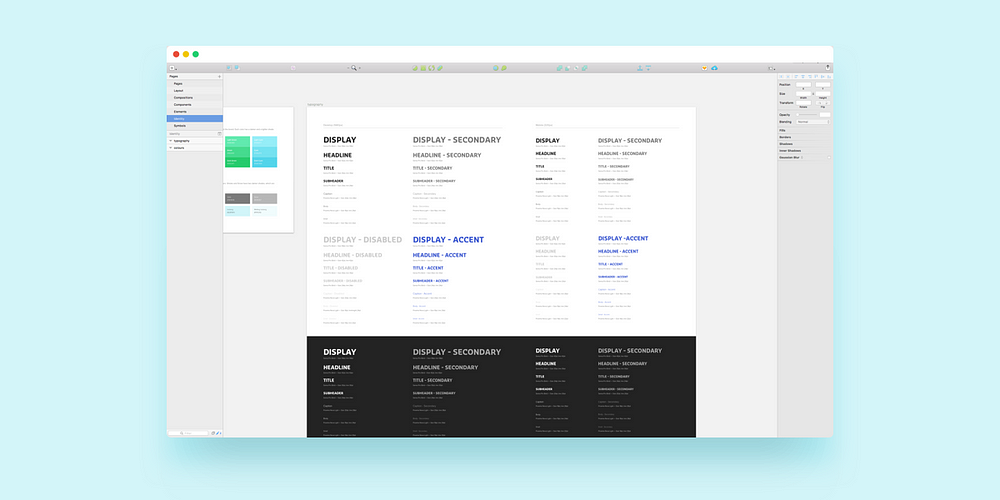
1. Identity
The first of these six group is Identity. Herein we define the project’s core brand elements. Typefaces, typography, primary and secondary colours are all meticulously specified. Afterwards these are used throughout the project.

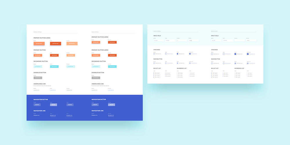
2. Elements
The second group defines the project’s smallest reusable parts: elements. A few well-known examples of elements are things like: buttons, links, inputs, drop-downs etc. Each of them is defined, along with all their states; such as hover, focus and disabled buttons. Our mantra is: Define once, reuse throughout the project.
3. Components
Working our way up in scale, the third group is Components. When working on designing apps and web-designs, most blocks on the screen are Components. A Component can be anything that uses at least a few Elements. Things like cards, heros and navigation menus are traditional examples of Components. However, they do not necessarily have to look modular.

When designing Components, we also create versions of it for each of the project’s responsive sizes (or breakpoints) straight away. This way we never have to backtrack to screens we’ve designed weeks ago, and make them fit on a smartphone afterwards. The responsive targets are agreed upon in advance with the client and each component is designed accordingly.
4. Compositions
Going up in scale once again, the fourth group is Compositions. A Composition is a part that has multiple Components inside it. They define how to Components inside it should behave.
Below is an example of a simple column layout. This is a very simple Composition. It only defines some whitespace around the Composition, a title and how the Components inside is should loop. Peanuts!

5. Layout
The fifth group, Layout, is a more abstract collection of design principles. Herein the amounts of whitespace, grids and wrappers are defined. By defining them like this, it is easy for other designers to come into a project and use the existing styles and guidelines.

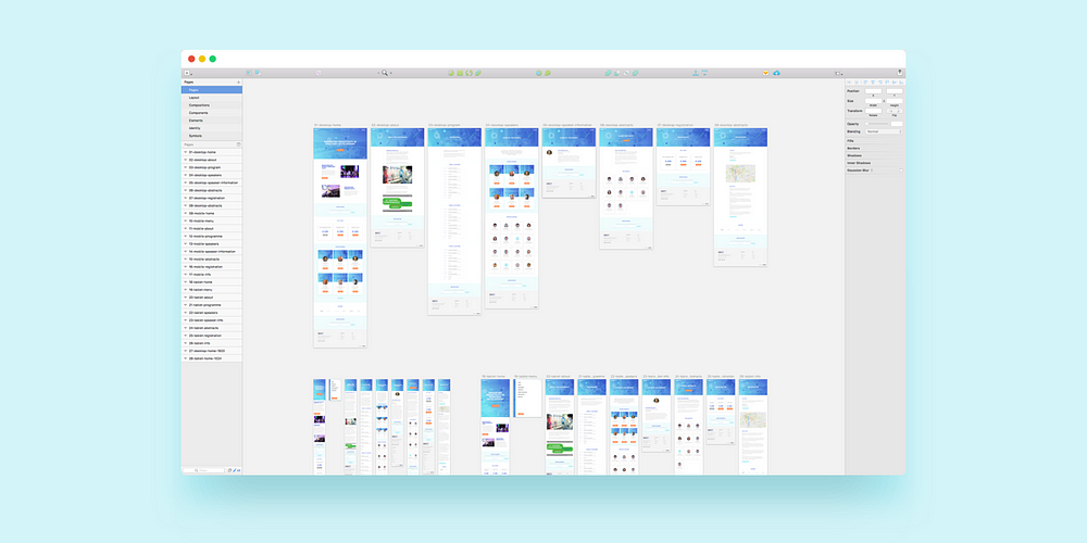
6. Pages
The last group are the actual Pages (or screens) of the project. Each Page consists of an arrangement of Compositions and Components.
All the weird exceptions are defined at Page-level. Let’s say the contact Page should have a blue background, because our friends in the marketing department say so… We add that only at Page-level.
Example
Let’s look at a very simple example of Component Based Design.
Say we’re selling tickets to some event. There are three different tickets available. Each of the tickets is represented in the same way, with a limited number of elements inside it– in this case a button and some text. This means a ticket should be represented as a Component: the Ticket-Component.

Now, let’s say we want to feature the three tickets on our homepage in a simple three-column layout. This is where we decide to design a Composition: the Tickets-Composition. This Composition specifies that each of the Ticket-Components should have some room in between them and a title above them.

Two days after the launch of the project the client wants to add some text to the tickets, saying they’re sold out. This means we only have to update the Ticket-Component and send it along to the developers. Quick as a cricket!
Sketch
It’s no secret that Sketch has quickly become the go-to application for UI and UX design. Leveraging Sketch’s text styles, symbols and artboards allowed us to finetune our Component Based Design workflow immensely. We developed a wonderful Sketch template that has all these principles built in, so we can quickstart a project quickly.
Spending a little more time defining all your text styles saves a lot of time overall.
Wrapping up
In short, Component Based Design allows us to quickly design many screens that are easy to maintain and update with new features. Multiple designers can work on the same project in unison because everything is clearly defined.
How can we improve these definitions? We’d love your input!
If you enjoyed this, please consider recommending or sharing this article– it really helps! Find us on Dribbble to follow along with our projects.