How pixel density works and how it affects your designs.
Pixel Density, Demystified from Peter Nowell on Vimeo.
This article & video were originally created as part of the UX course in Sketch Master.
This animated video covers most of the topics in the article, but if you’re interested in more exciting and nerdy details, definitely keep reading.
Pixel density refers to how many pixels have been squeezed into a physical amount of space (often an inch). On the first Mac, there were 72 pixels per inch — which may sound like a lot but it actually required that graphics conform to these huge pixels.

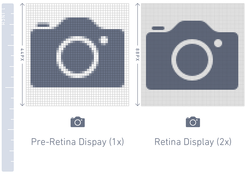
Screen technology has evolved tremendously since then, and now even the most basic computer screens are somewhere in the 115 to 160 pixel per inch (“ppi”) range. But a new chapter in this story began in 2010 when Apple introduced an iPhone with a Retina Display — a super crisp screen that doubled the pixels per inch. The result was graphics with so much more clarity than we’d ever seen.

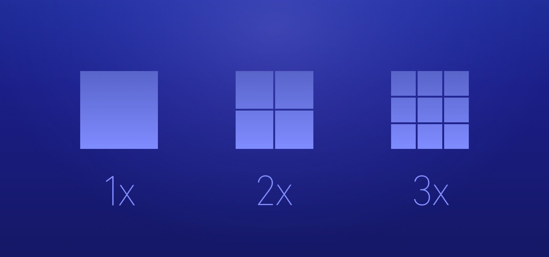
In order to maintain the same physical size for the user interface, pixel dimensions doubled. A 44px tall button was now 88px tall. To accommodate different devices, designers needed to start providing graphics (like icons) at both the original “1x” scale and also this new “2x” scale. But there was an emerging problem: you could no longer say “hey, this button should be 44 pixels tall,” because it should also be 88px tall on a different device. There was no pixel-density-independent unit of measurement. The solution was “Points,” or “pt” for short. 1 point equates to 1 pixel on a pre-retina display, or 2 pixels on a 2x retina display. They allow designers to say “hey, this button should be 44 points tall” and then any device can just multiply that by its own pixel density ratio… like 1x or 2x. Or 3x in the case of Apple’s plus-sized iPhone.
PT & DP
But this isn’t just for Apple devices of course, these days every operating system — desktop or mobile — supports high ppi/dpi screens. Google has defined their own density-independent unit for Android. They aren’t called “points”, they’re called “DIPs”, which stands for density-independent pixels. The shorthand is “dp”. They’re not exactly equivalent to points in iOS, but the idea behind them is the same. They’re a universal unit of measurement, that can be converted to pixels using a device’s scaling ratio (2x, 3x, etc.).
You may be wondering about the physical size of a point. There’s actually very little practical need for UI designers to worry about it, because we have minimal control over device-specific alterations. Designers just need to trust that the device maker has settled on a pixel density that is appropriate for that device, and focus our attention on preparing design assets at 1x, 2x, 3x, or any other ratio. But if you’re really curious, know that on Apple devices there’s no constant conversion between inches and points. In other words there’s no single pixel density that represents 1 point — it’s dependent on the specific device (see Perception of Scale section below). On iOS, a point varies from 132 points per inch to 163 points per inch. On Android, DIPs are always based off 160 ppi.
Controlled Chaos
Get ready for the reality check. In the early days of high resolution mobile devices, pixel density was as simple as 1x or 2x. But now it’s absolutely nuts — there are many pixel densities to support. Android is a perfect example: at the time of this article there are six common pixel densities across all the different device makers. This means that an icon that appears to be the same size on all of these screens actually requires 6 different graphics. For Apple devices it’s more like two or three different graphics.

Design in vector. Design at 1x.
There are a couple practical lessons to take away from all of this. To begin with, we should all be designing with vector shapes. That allows our interfaces, icons, and graphics to scale to any size.
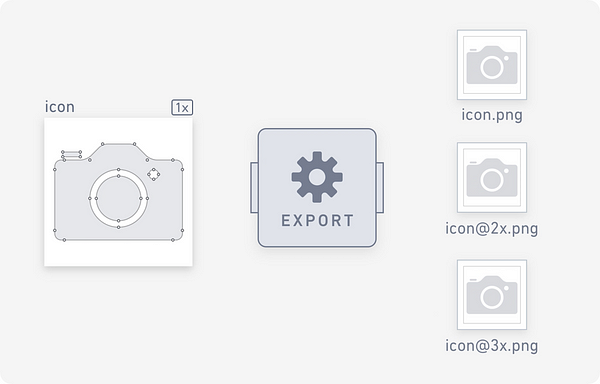
The second lesson is that we should all be designing at 1x scale. In other words, design using points for all measurements, then scale up to various higher pixel densities when exporting… as opposed to designing at a device’s final pixeldimensions (2x, 3x, etc.) and getting into all kinds of trouble during export. Because scaling a 2x graphic 150% to generate a 3x graphic produces blurry results, but scaling a 1x graphic 200% and 300% retains visual clarity.
Mockups for a standard-sized iPhone should be 375×667, not 750×1334 which is the resolution they’re actually displayed at. Most design tools don’t distinguish points from pixels (Flinto is the only exception I’m aware of), so it’s up to designers to pretend that units in pixels are actually points, then have the flexibility to export at two or three times the size.
Fake it ’till ya make it!
This is a bit more advanced, but it’s worth mentioning: sometimes devices fake it. They pretend their pixel-to-point ratio is a common one, like 3x, but it’s actually 2.61x and the image is scaled to 3x for convenience. This is what the iPhone Plus currently does. It shrinks an interface made at 1242×2208 down to fit on a 1080×1920 screen (the phone’s graphics chip performs this scaling in real-time).

Because the image is only being scaled down a little bit (87%), the result still looks decent — a 1px line on a nearly-3x screen still looks pretty darn crisp. And chances are, although I have zero inside information, Apple will probably release a true 3x iPhone Plus in the future as those hardware components become viable for a product made in such outrageous quantities. The current iPhone Plus is probably faking it until it makes it.
(Bruce Wang wrote a great articleabout the iPhone 6 Plus’s screen.)
Is this scaling-by-non-integers approach acceptable? Ultimately, the proof is in the pudding; is the scaling subtle enough to be imperceptible? Many Android devices also use scaling to achieve a more standard pixel-to-point ratio, and unfortunately some of them do it really poorly. Scaling like this is undesirable because everything that you designed to be crisp and pixel-perfect at a certain scale will become blurry due to interpolation (i.e. a 1px line becomes 1.15 pixels). Even if you’re not a fanatical pixel perfection nerd like I am, there’s no denying the fact that design elements need to align with full pixels in order to appear crisp to our eyes. Unfortunately as pixel densities enter the 4x and above range, the blurriness caused by non-integer scaling becomes far more difficult to perceive, so I predict that device makers will be using this approach more as time goes on. We can only hope that the performance drawback of scaling will deter them!

Your Eye’s Perception of Scale
Let’s put all this pixel density stuff aside for a minute, and consider this question: should a button always be the same physical size across devices? Of course we’re just using a button as an example, but we could be talking about an icon, or text, or a toolbar. Should these be a consistent size across all devices? The general consensus is that it depends.
- It depends on the precision of the input method (i.e. touch vs. cursor)
- It depends on the physical size of the screen
- And it depends on your distance from the screen
Those last two kind of go hand-in-hand; because a tablet has a bigger screen than a phone, we hold it farther away. Then you get to a laptop, then a desktop, then a TV… the distance increases with screen size.

A button on your TV screen might actually be the size of your phone — because it has to be from that distance.

Here’s a less dramatic and very real example of this: the app icons on a tablet need to be larger than those on your phone, and this is accomplished in two ways: by using a lower pixel density and by changing the dimensions of the button (e.g. in points).
Lower Pixel Density
Larger screens that we use at a distance tend to have lower pixel densities. A TV might be as low as 40 pixels per inch! For typical TV-viewing that’s permissible. An iPad’s retina display is around 264ppi while an iPhone’s retina display is 326ppi. Because the pixels on an iPad are larger (the screen is less dense), the entire interface becomes slightly larger. That accounts for the extra distance from the iPad’s screen.
Different Dimensions
But every once in a while, using a lower pixel density isn’t enough… a specific design element needs to be even larger. This happened with app icons on the iPad. On the iPhone they’re 60×60, but the iPad’s larger screen offers a lot more space, so there’s a considerable practical (and visual) upside to using 76×76 app icons.

Changing an element’s dimensions for different devices creates more work for designers. It’s one of the few scenarios where Apple devices require more sizes than Android devices! Fortunately, it’s not very common outside the realm of app icons.
Sanity Check?
We’ve just discussed a ton of co-existing complexities for you to reconcile. Fortunately, interface design is just a matter of using density independent units (like pt or dp). It’s more complicated for app icons, but there are templates to help you with that. Here’s a list of resources on these topics:

Essential Resources
Google Device Metrics: An impressive list of specs for devices of all kinds (Android, iOS, Mac, Windows, etc.). Get screen dimensions, pixel density, and even the approximate distance the device is held from a user’s eyes.ScreenSiz.es is a similar resource.
Bjango App Icon Templates: These design templates (available for all major design software) are immensely comprehensive. Useful both practically and as a reference to the latest specifications for Android, iOS, macOS, tvOS, watchOS, Windows, Windows Phone, and more.
Designer’s Guide to DPI: This extensive guide by Sebastien Gabriel covers even more details and practical workflows for Android and iOS designers.
Check out more of the top pixel density resources for designers.